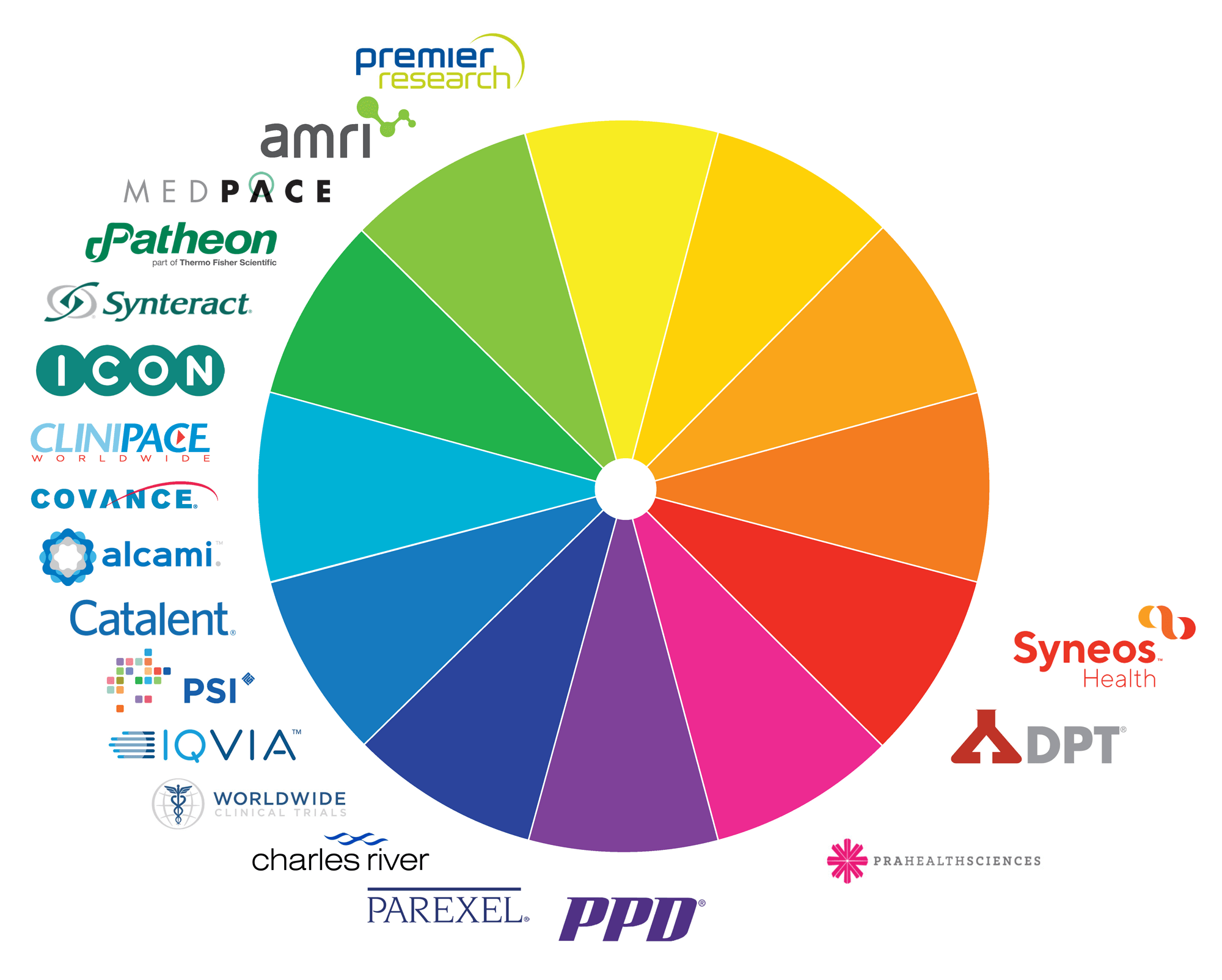
At SCORR, our creative team works with a variety of companies to strategize strong, unique brands and logos that differentiate each business in the health science industry. When we partner with clients to create their logos, identity systems and brands, we always look at the competitive landscape in terms of the color wheel. This approach plays a critical role in determining the overall strategy of the design direction.
Placing the logos of major CROs, CMOs and CDMOs on the color wheel, it’s clear that the blue and green logos occupy a crowded space. This is no surprise, considering the emotions these colors elicit in relation to the industry. The color blue represents feelings of trust, credibility, strength, confidence and integrity, while green conveys health, growth, reassurance and life. Most companies in the health science industry want their names to evoke such positive associations. But how do you differentiate yourself in a color space that is so crowded?
Standing out
The blue/green space on the color wheel is heavily populated, reflecting the ideals of the industry. By applying a few key techniques, you can position your company logo to stand out in that color space:
- Overall design: In addition to color choices, the overall direction of your logo design should be a strong differentiator to set you apart. Is it conservative and grounded or modern and fresh? Your design decisions around fonts, custom elements, iconography and orientation play a major role in making your logo unique and impactful.
- Accent colors: Logos are typically categorized by dominant color but pairing that color with a cohesive accent color will help set your logo apart while adding another dimension of meaning.
- Unique shades: There may be many blue and green logos in the industry, but there is also a multitude of different shades of blue and green in the color spectrum. Experimenting with unique shades and combinations of shades will help give you the edge you need to stand out from the competition.
Breaking out
Another strategic way to differentiate your company, brand and logo is to move beyond the crowded blue/green area, find your distinct color and own it. Companies like PPD, PRA, DPT and Syneos have claimed spots on the wheel with less surrounding competition and leveraged that differentiation to their advantage. PRA has applied this technique with the most success, focusing its logo and branding on a bright pink that can’t be missed. In this case, pink is used to convey compassion, communicate energy and motivate action. PRA has been able to use pink to draw attention, and then back that up with messaging and branding that give deeper meaning to its color choice.
Color increases brand recognition by up to 80 percent.
(Source: University of Loyola, Maryland, study)
It can be challenging to own a spot on the color wheel because of the ever-changing nature of the health science industry. Big shifts on the color wheel recently occurred with several noteworthy mergers and acquisitions such as QuintilesIMS rebranding as IQVIA, INC Research and inVentiv becoming Syneos, and LabCorp acquiring Chiltern for its Covance segment. These shifts can free up space on the color wheel or add a competitor in your territory with little warning.
Beyond color
Being knowledgeable about what color conveys about your company and cognizant of how your competitors are using it are key elements in carving out a unique spot for your company. It’s important to note that this is not as easy as just choosing some colors and implementing them. Your company needs to embrace the strategy and meaning behind the colors you choose, and your logo, identity and branding need to all be in sync, communicating the same unified message to your audience.


